Rivon.
A brand identity for a luxury mountain resort. Quiet, warm and made to sit naturally in the landscape.
The challenge.
Give a luxury mountain resort a brand as calm and confident as the place itself.
Our approach.
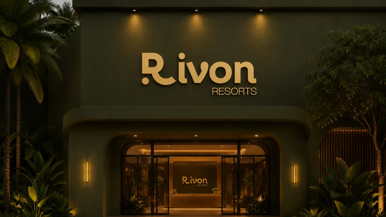
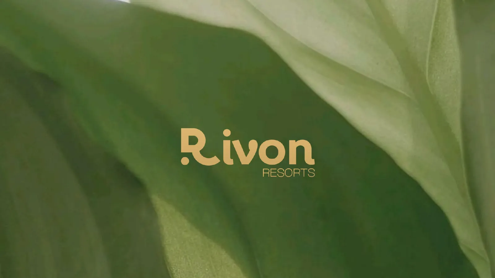
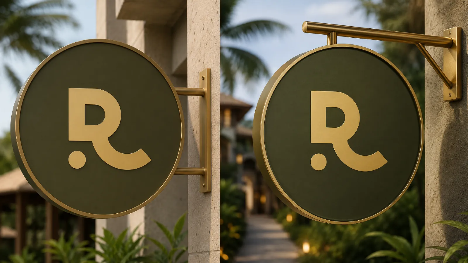
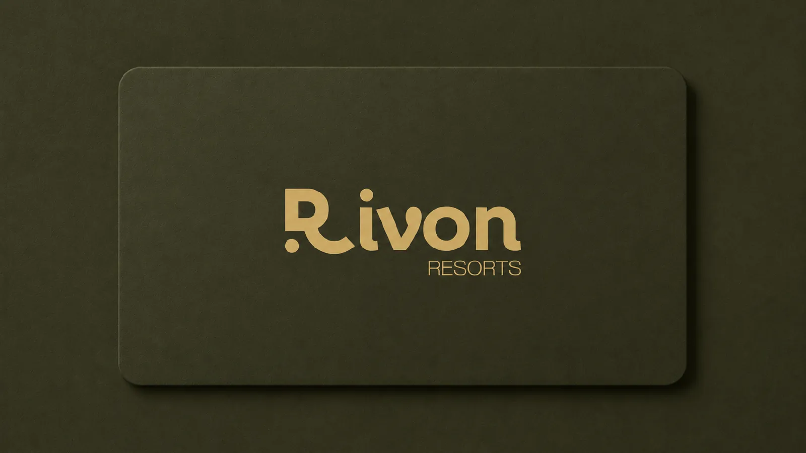
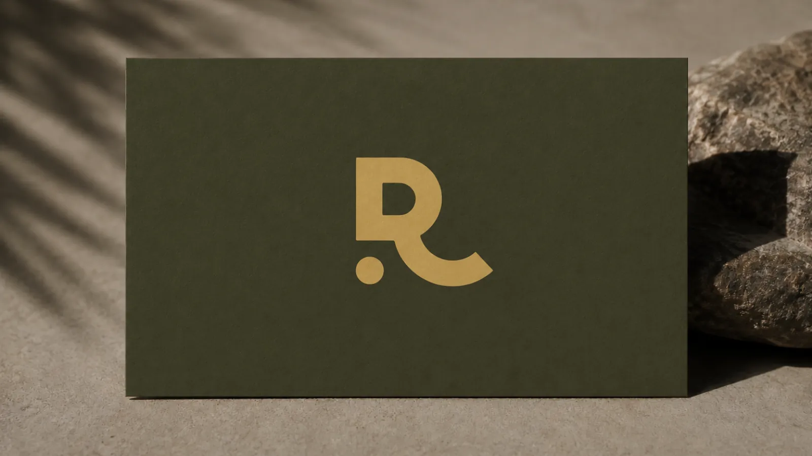
We kept it quiet. Deep olive and soft gold, a soft rounded wordmark and a monogram R with a single round dot. All drawn on a strict grid, so the mark stays clear on a hotel wall, a hanging sign or a business card.
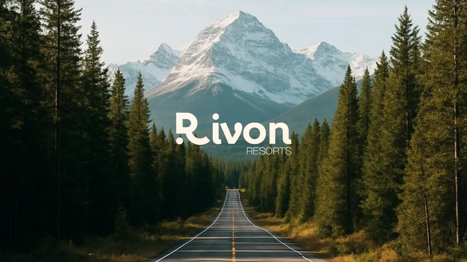
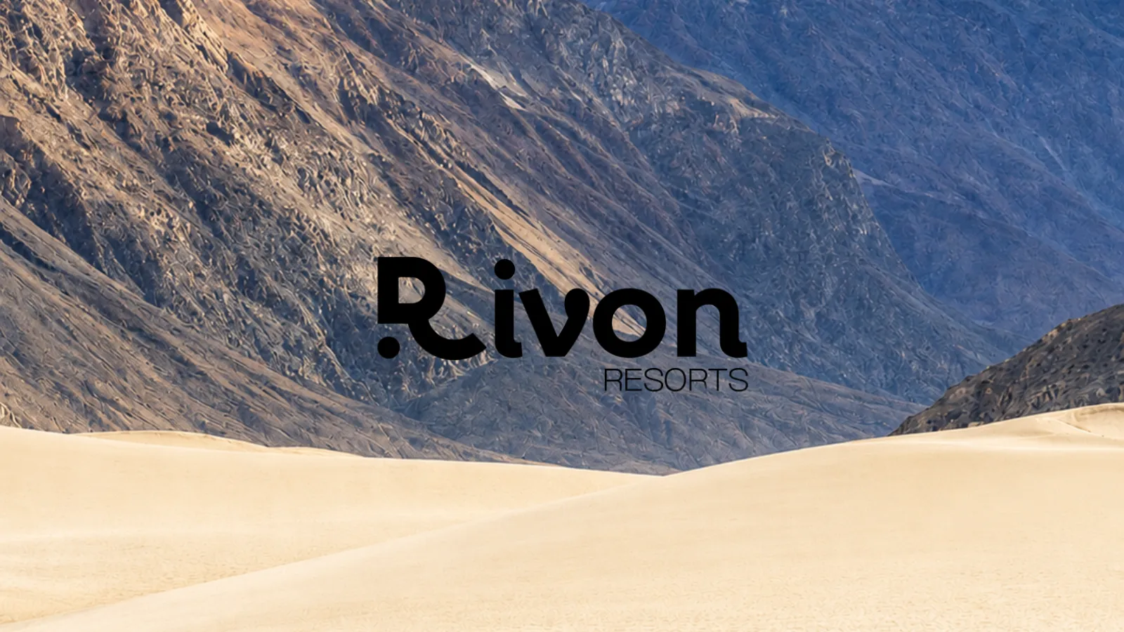
One mark. Any landscape.
The identity.
Four building blocks, each designed to work on its own and together.
- 01
Logo and monogram
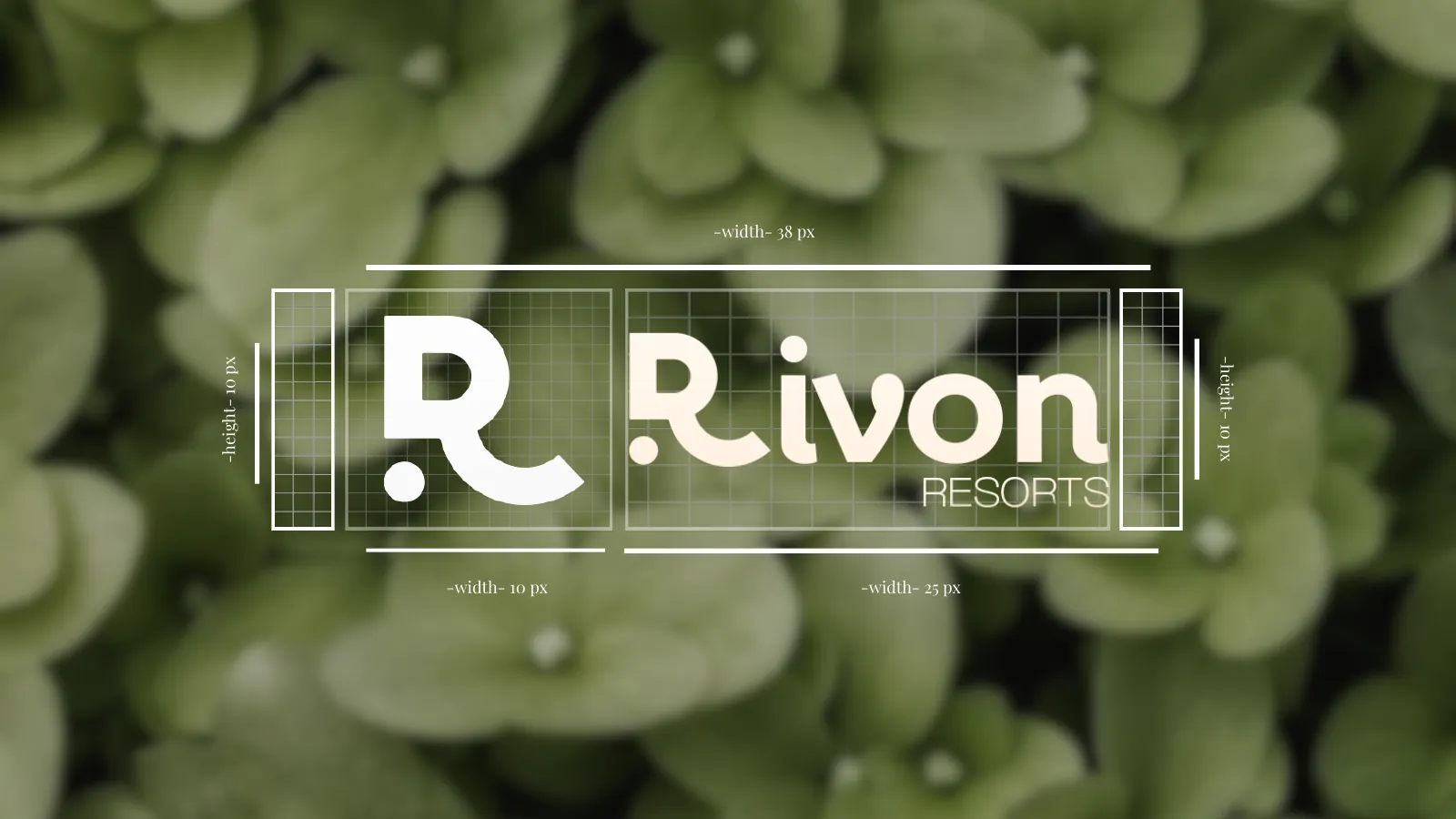
A soft, rounded wordmark and an R with a single dot, built on a precise grid.
- 02
Colour
Deep olive for calm, black for contrast and white for light.
SerenityMidnightFresh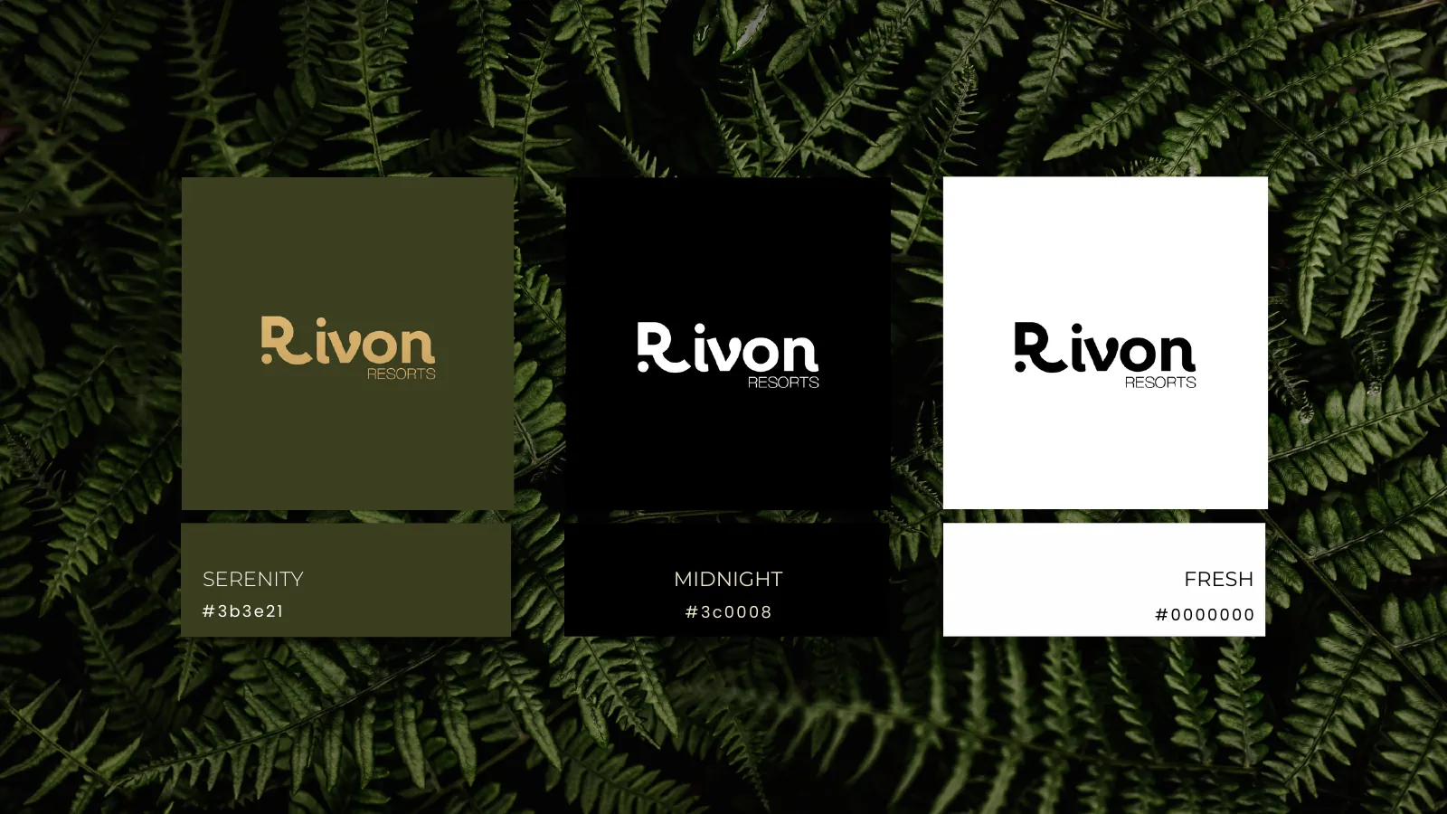
- 03
Typography
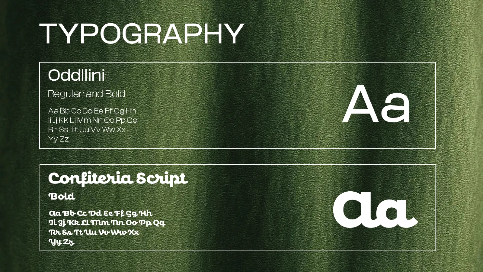
Oddlini for clean everyday text and Confiteria Script for a warm, personal touch.
- 04
Monogram pattern
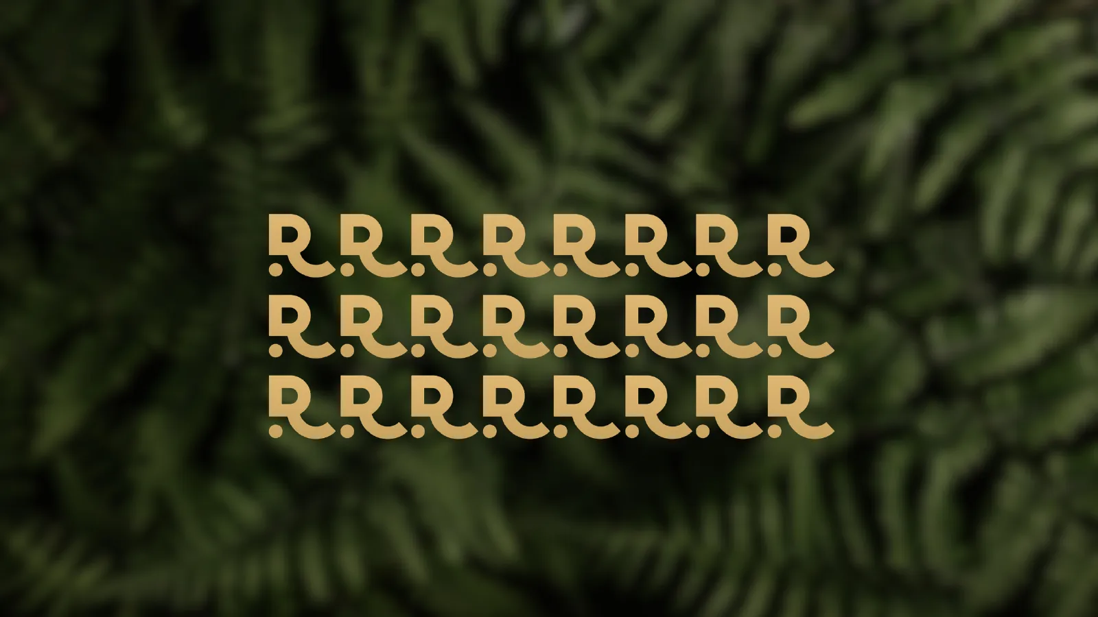
The R repeated in gold for walls, packaging and printed details.
The brand in the real world.
Want a brand that feels this considered?
Tell us about your business. We'll show you how we'd bring it to life.