Rotango.
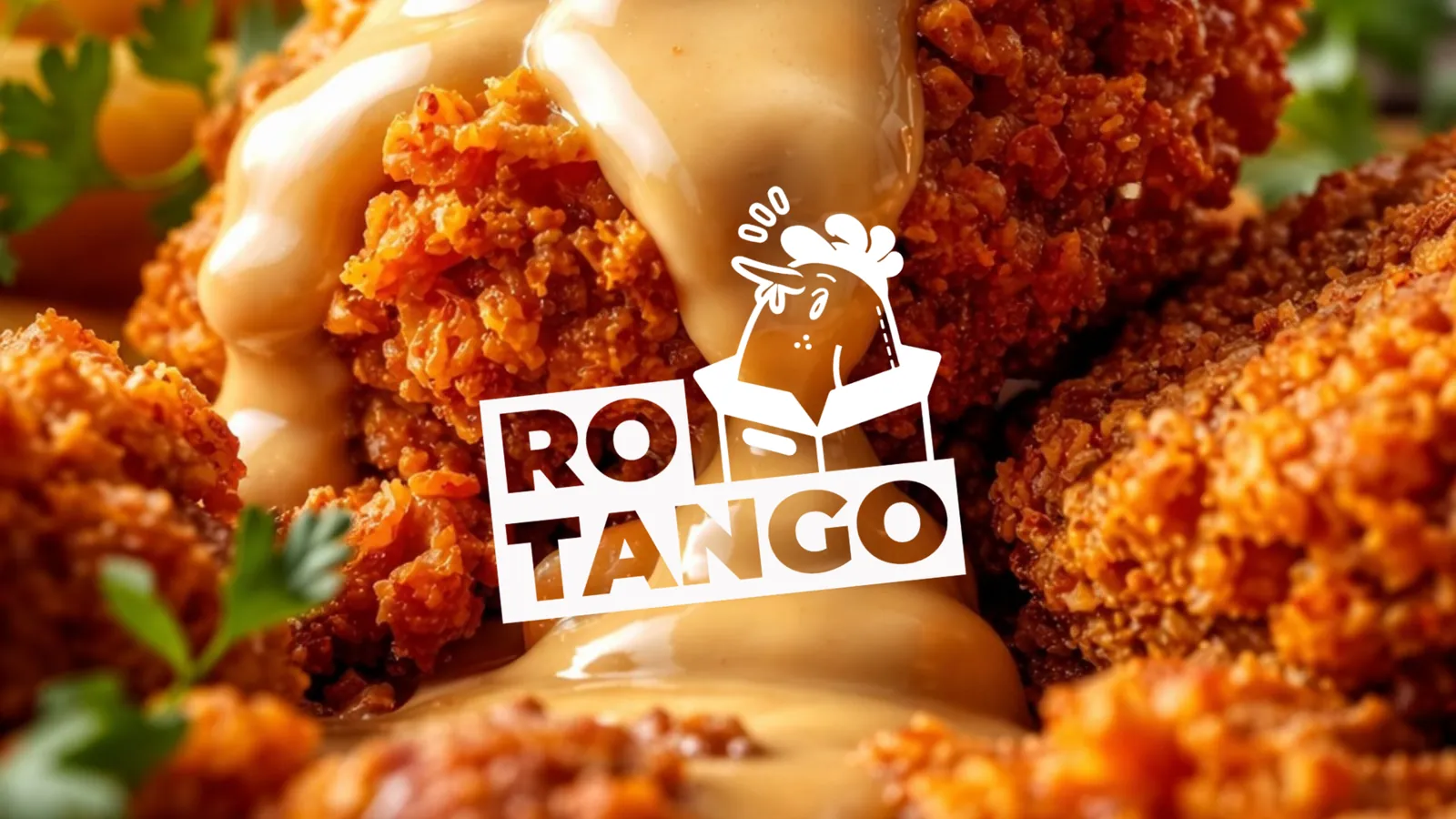
A complete brand for a rotisserie chicken restaurant. A name with a story, a mascot with attitude, and a look that works from the box to the feed.
The challenge.
Launch a new chicken restaurant with a brand loud enough to stand out on a busy high street.
Our approach.
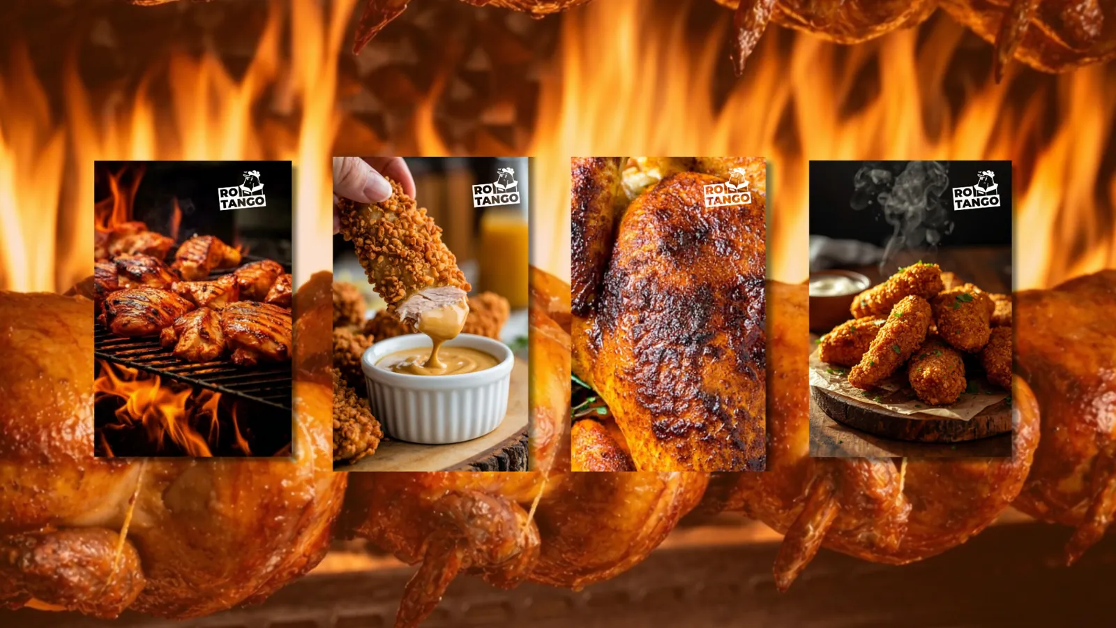
We built everything around one idea: food with rhythm. A cheeky chicken mascot, one bold orange and lines people want to repeat. Then we put it everywhere a customer looks, from the bag in their hand to the post in their feed.
Two ideas. One name.
It's not just food. It's a celebration.
The identity.
Five building blocks, each designed to work on its own and together.
- 01
Logo and mascot
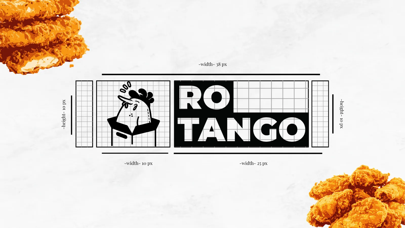
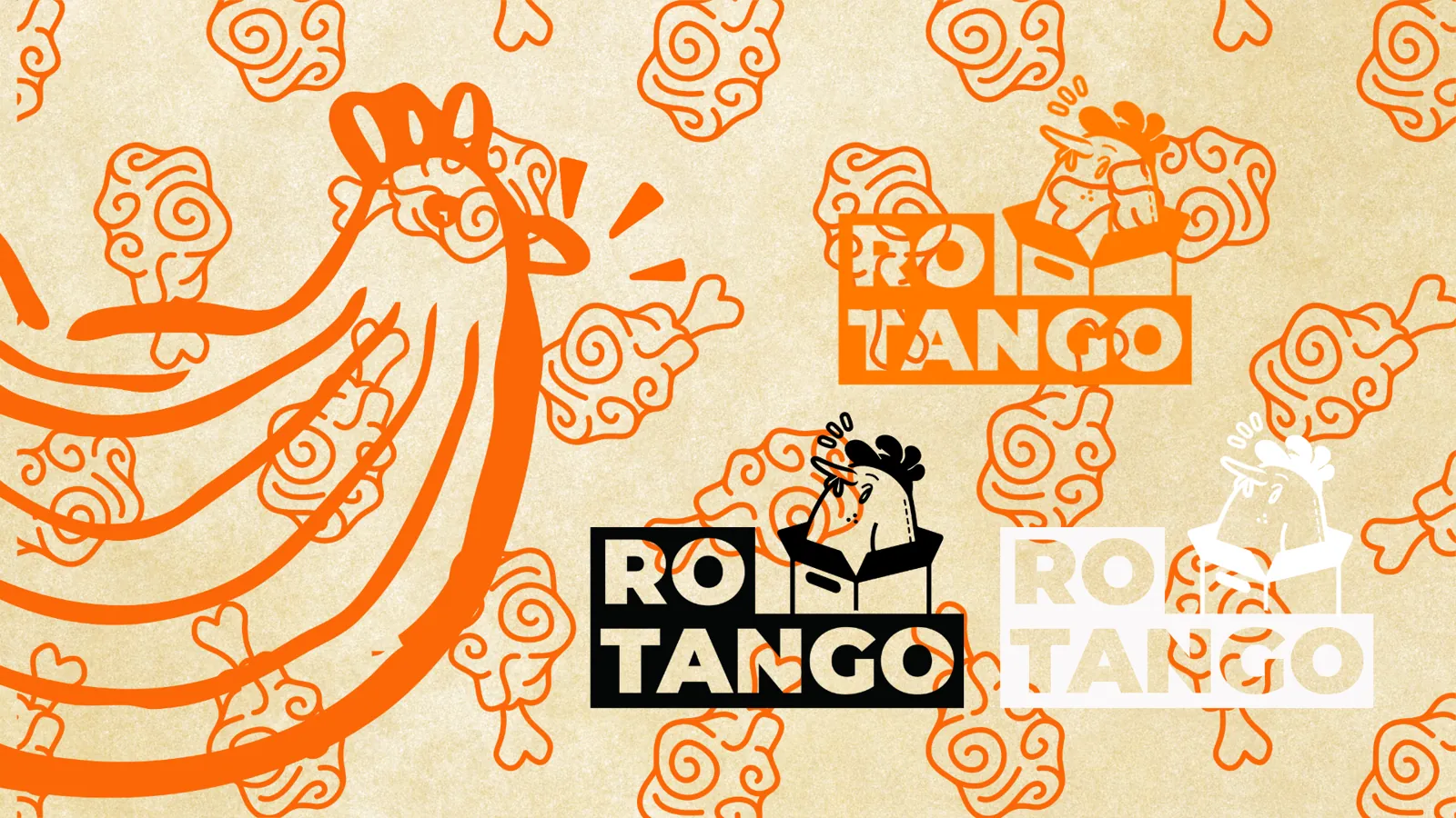
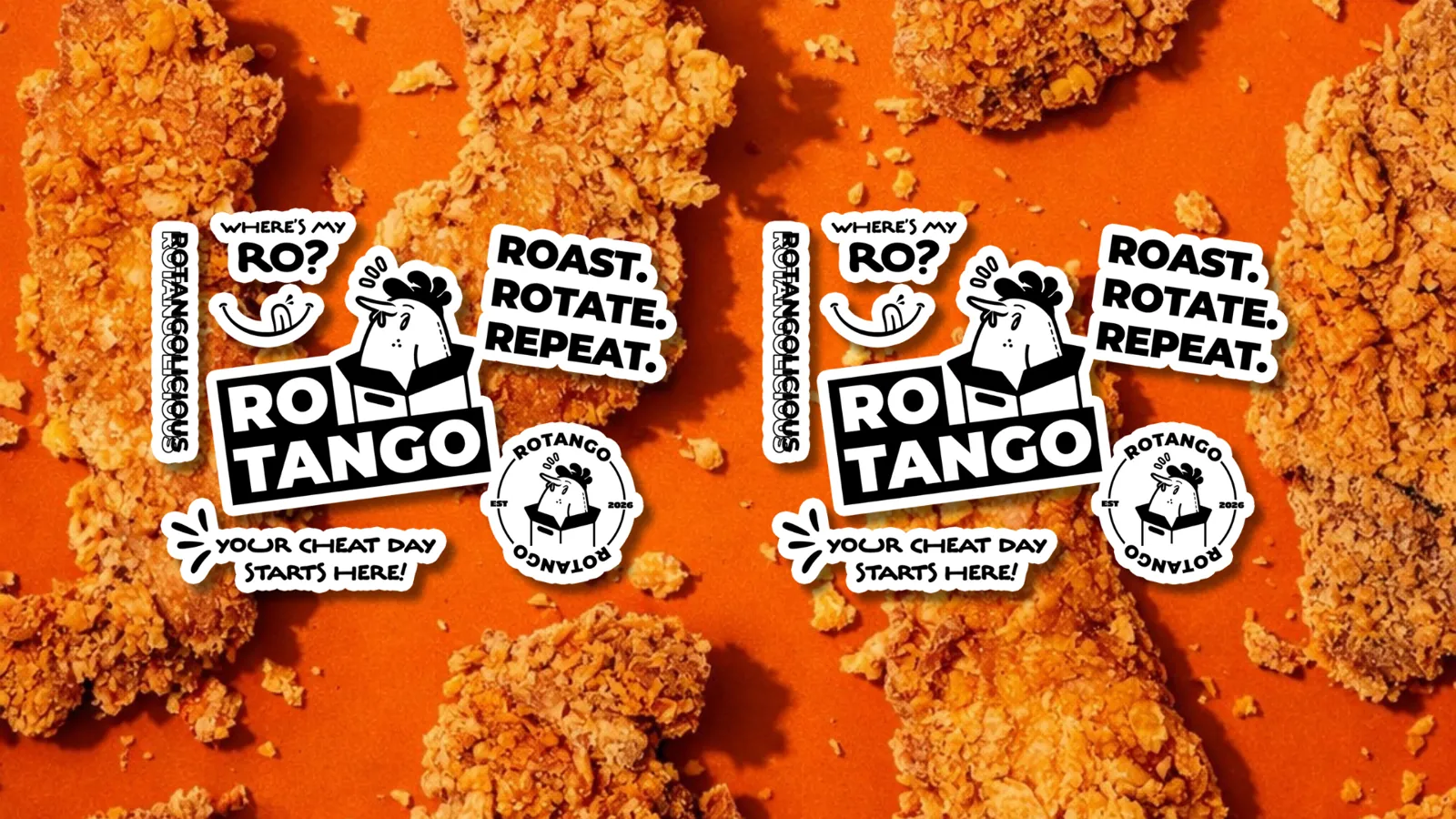
A chicken popping out of its own box, drawn on a strict grid so it stays sharp from a sticker to a shop sign.
- 02
Colour
One loud orange that owns the counter, backed by clean white and deep black.
RotangoMoistOverpower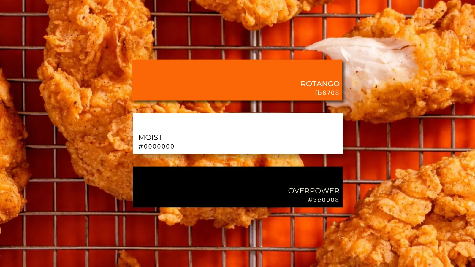
- 03
Typography
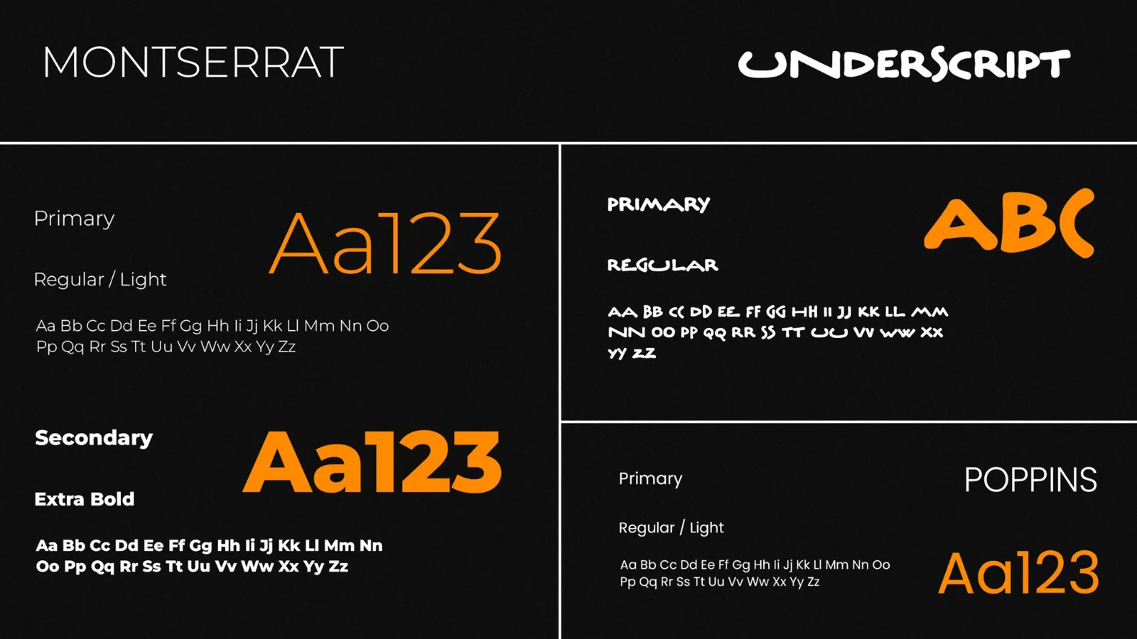
Montserrat for clarity, Underscript for personality and Poppins for everyday use.
- 04
Logo variations
Full colour, black and reversed versions, plus a hand-drawn rooster for big moments.
- 05
Patterns
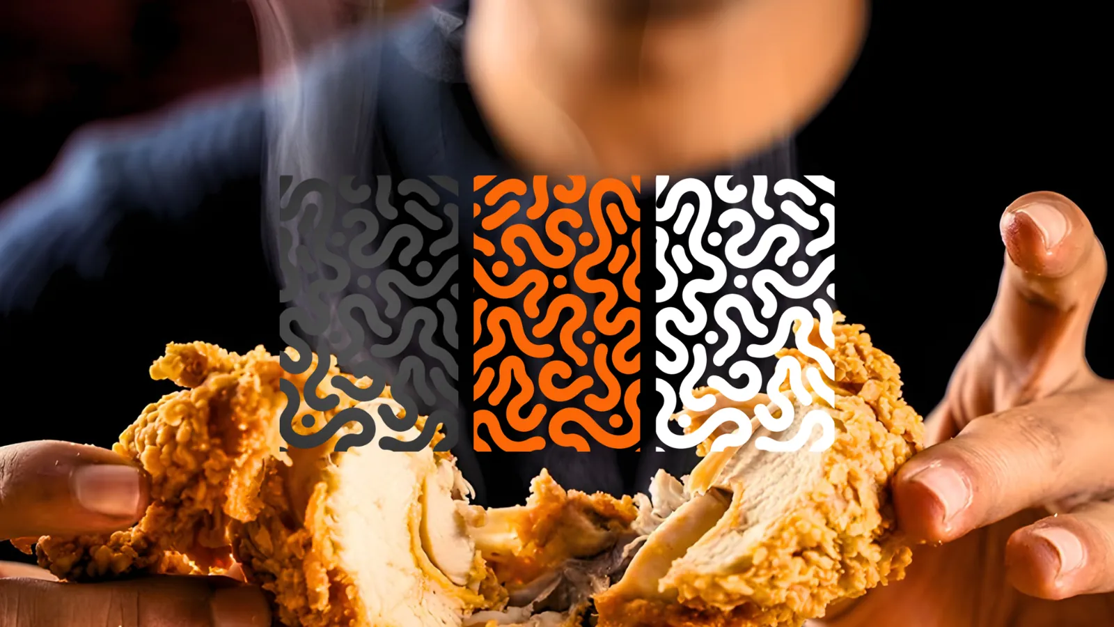
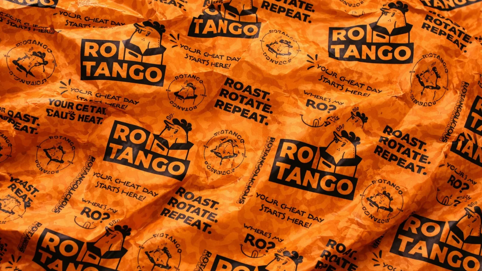
Playful line patterns in orange, black and white for packaging, walls and wrapping.
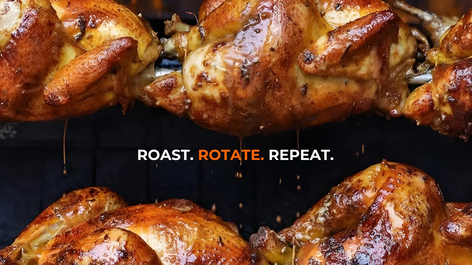
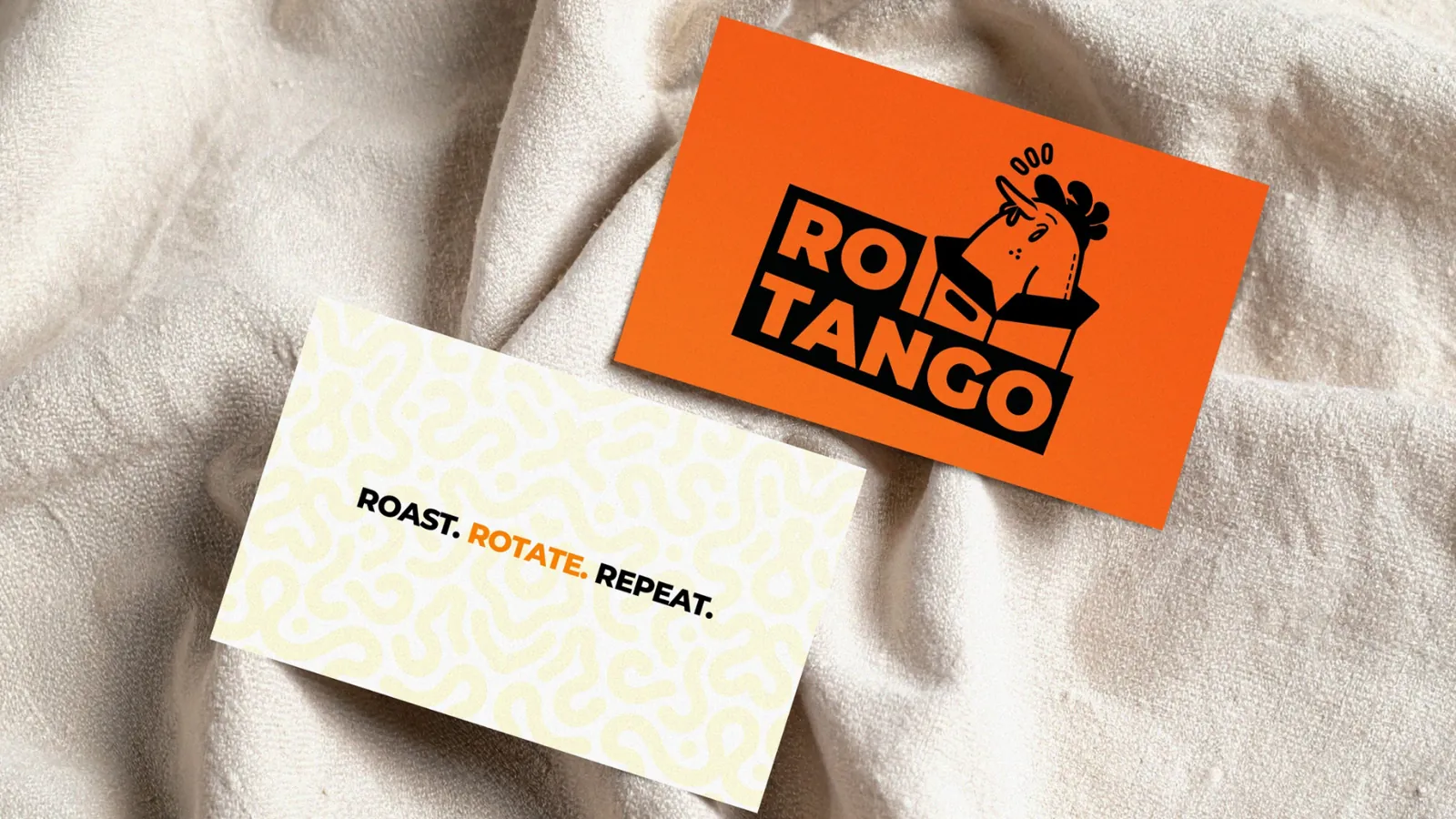
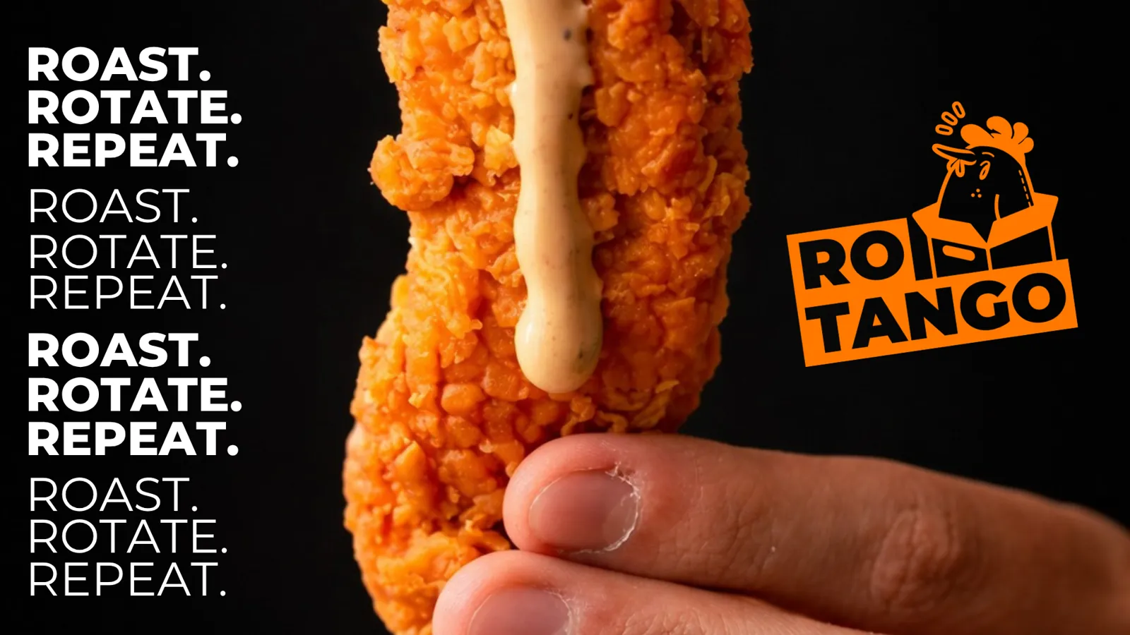
Short, loud and easy to repeat. We wrote taglines for the menu, the packaging and the feed, so the brand speaks the same way everywhere.
One line. Everywhere.
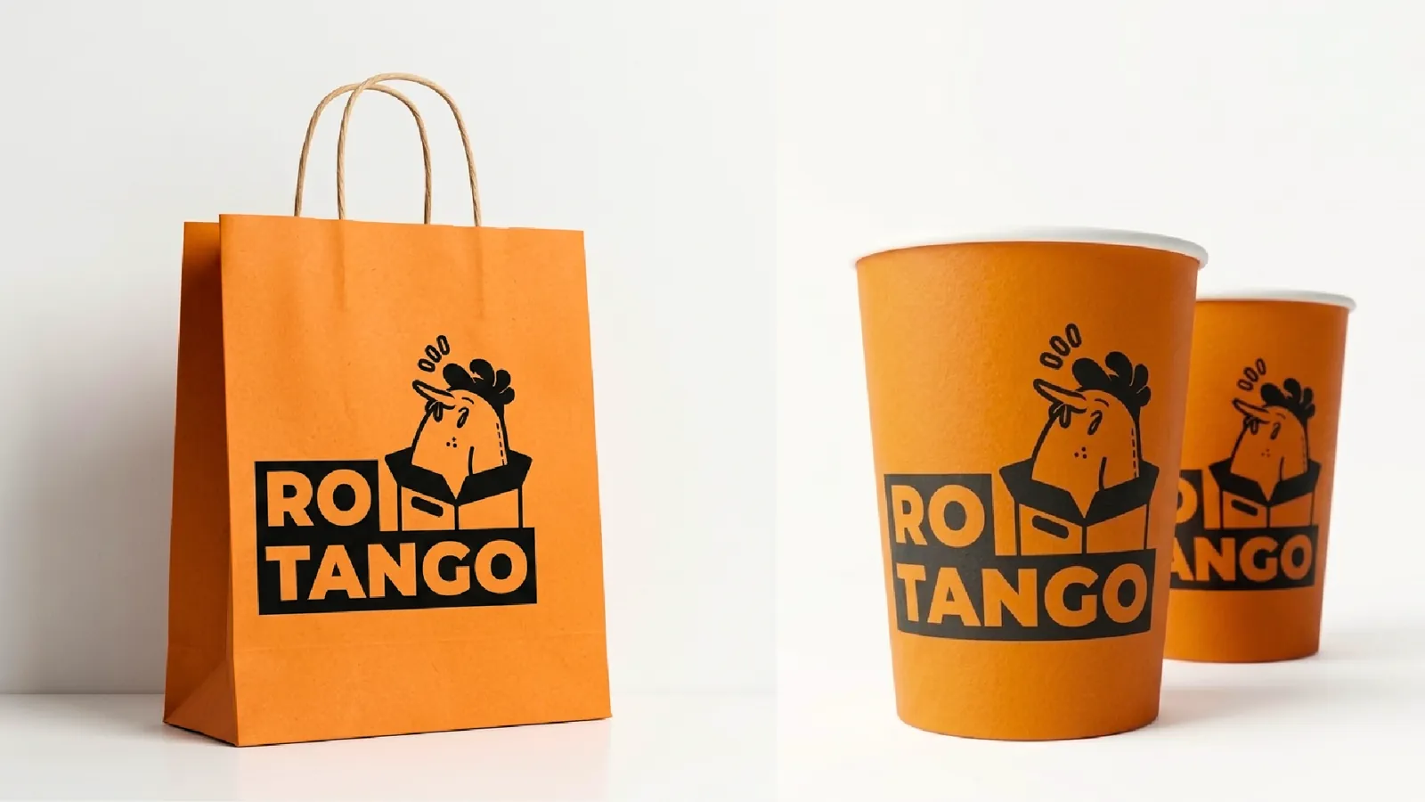
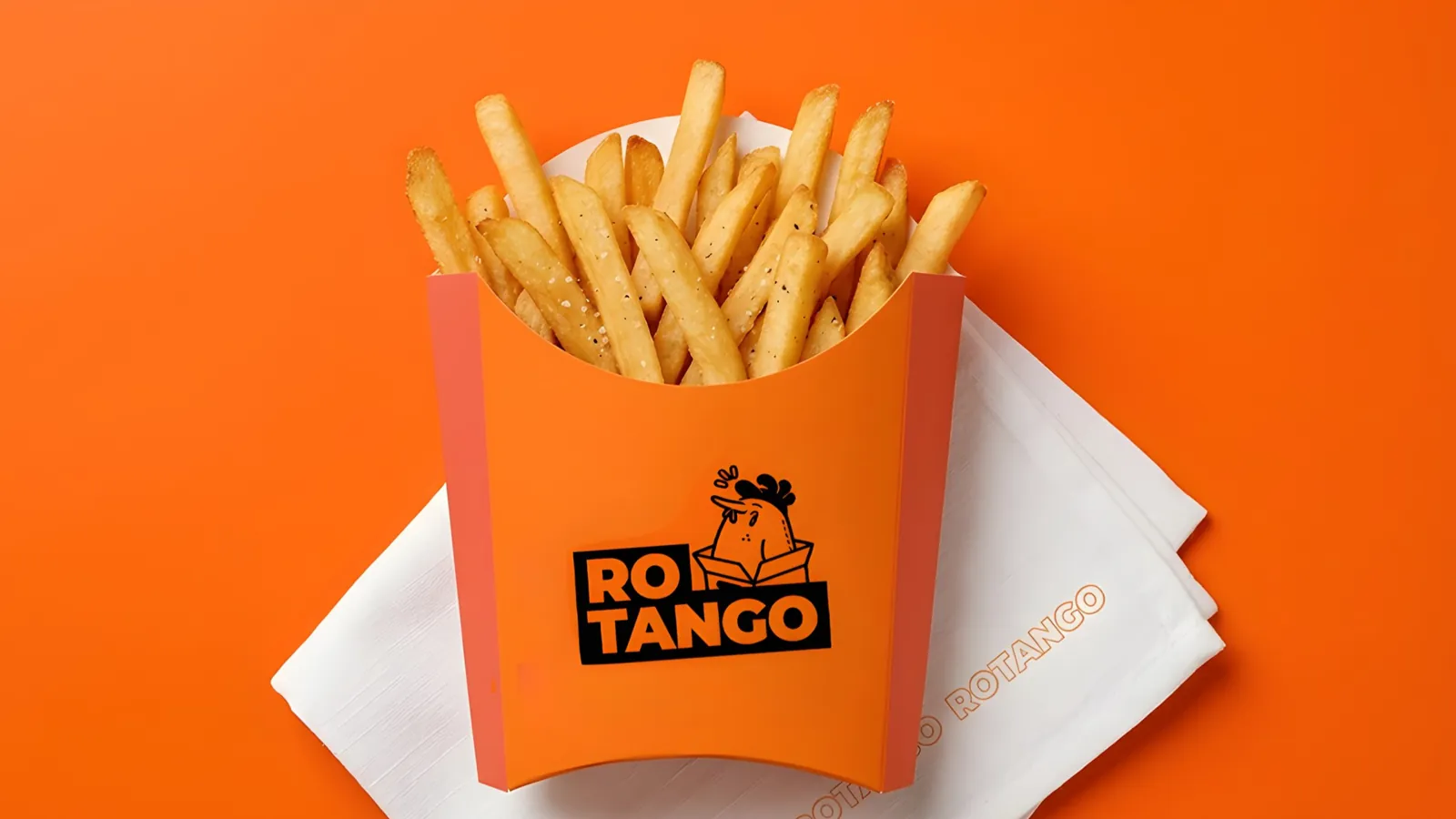
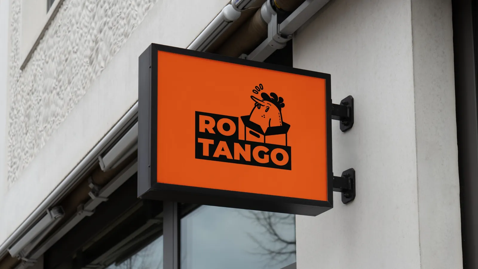
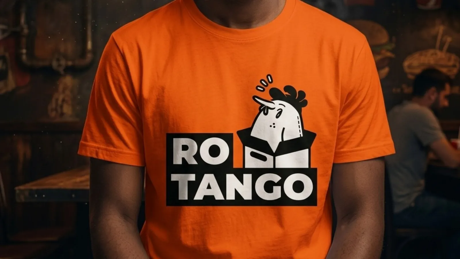
The brand in the real world.
Want a brand people remember?
Tell us about your business. We'll show you how we'd bring it to life.