Flōdeura.
A brand identity for a fragrance house that makes luxury feel within reach, without losing any of its elegance.
The challenge.
Launch a fragrance brand that makes luxury feel accessible, without losing any of its elegance.
Our approach.
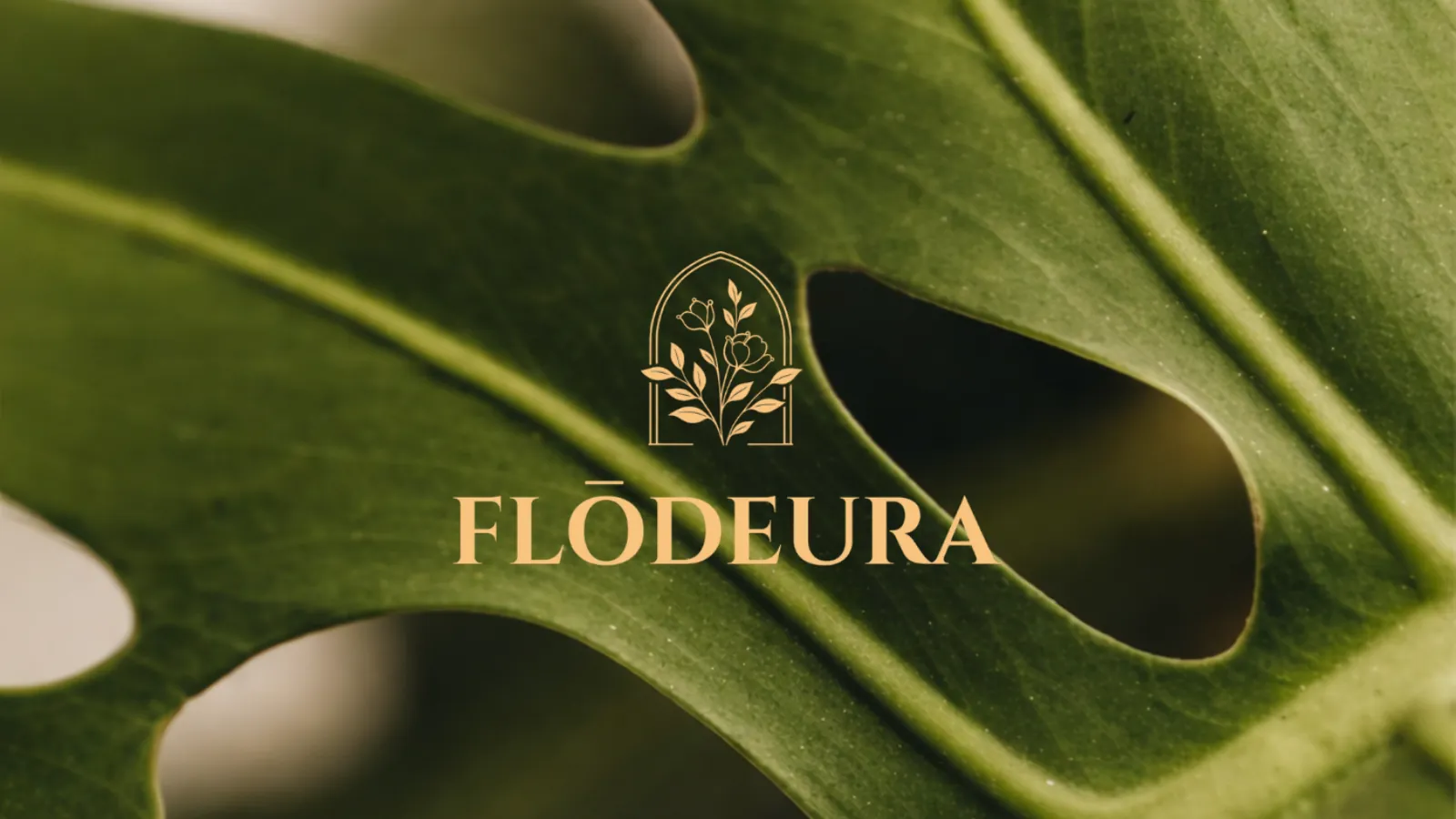
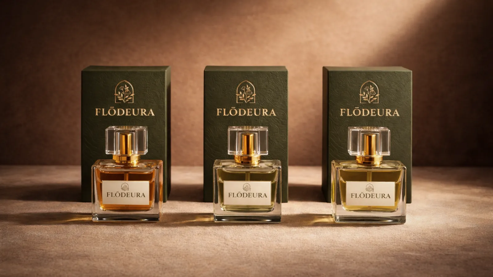
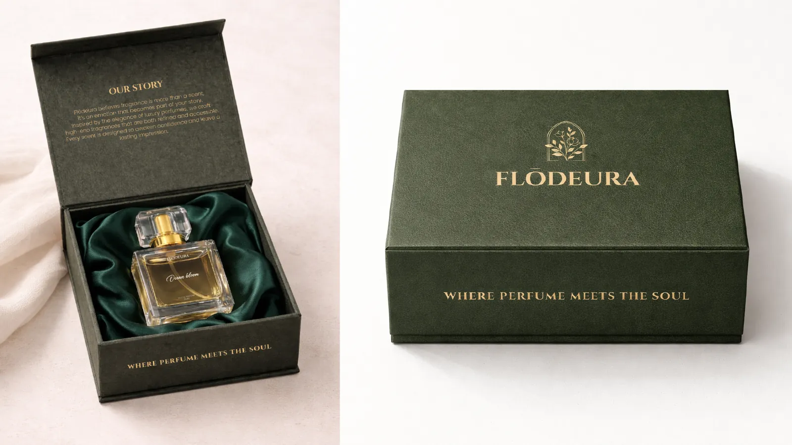
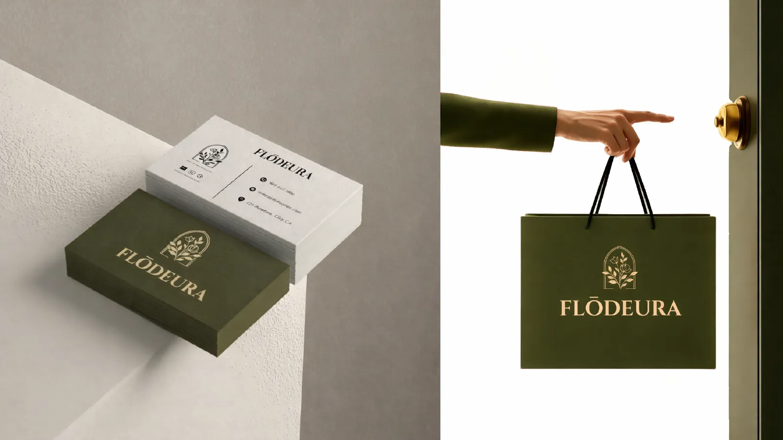
We built the brand around quiet confidence. A classical serif, a botanical emblem inside an arch, deep olive and warm gold. Every touchpoint feels like a boutique, from the perfume box to the shopping bag.
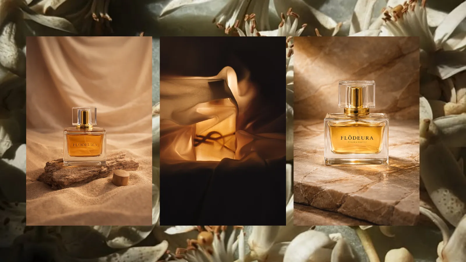
Scent, in pictures.
The ingredient imagery behind the brand, from soft florals to smoked wood.





The identity.
Five building blocks, each designed to work on its own and together.
- 01
Logo and emblem
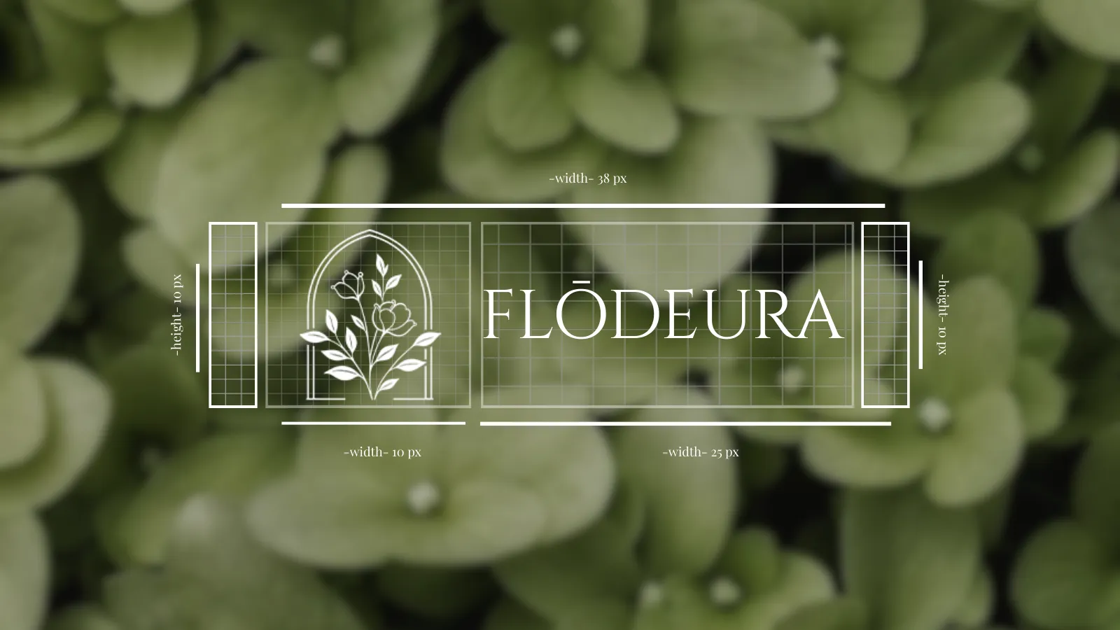
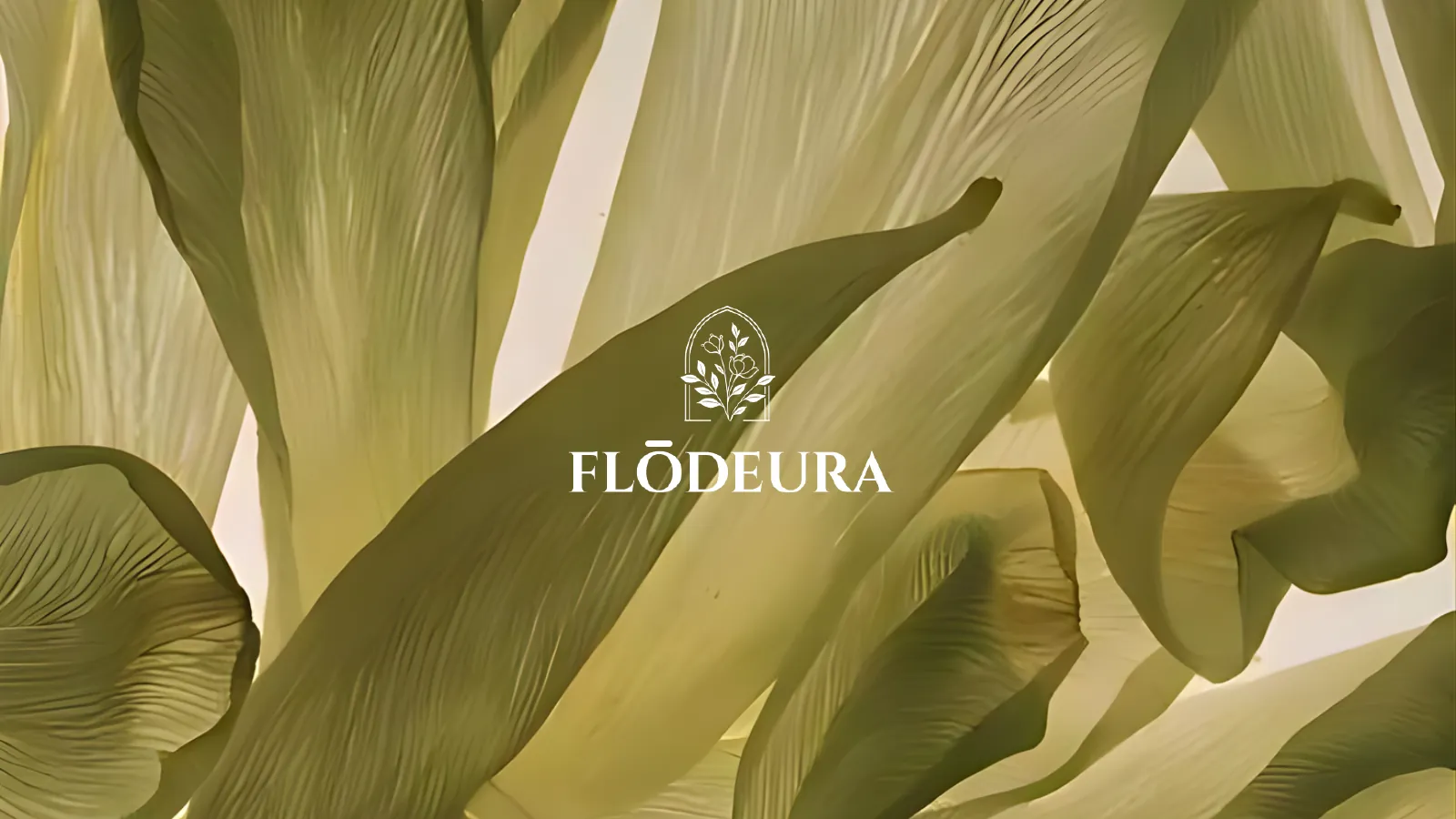
A botanical drawn inside an arch, paired with a refined serif wordmark and built on a precise grid.
- 02
Colour
Deep olive, black and white. Three shades, one refined identity.
FloralOverpowerMoist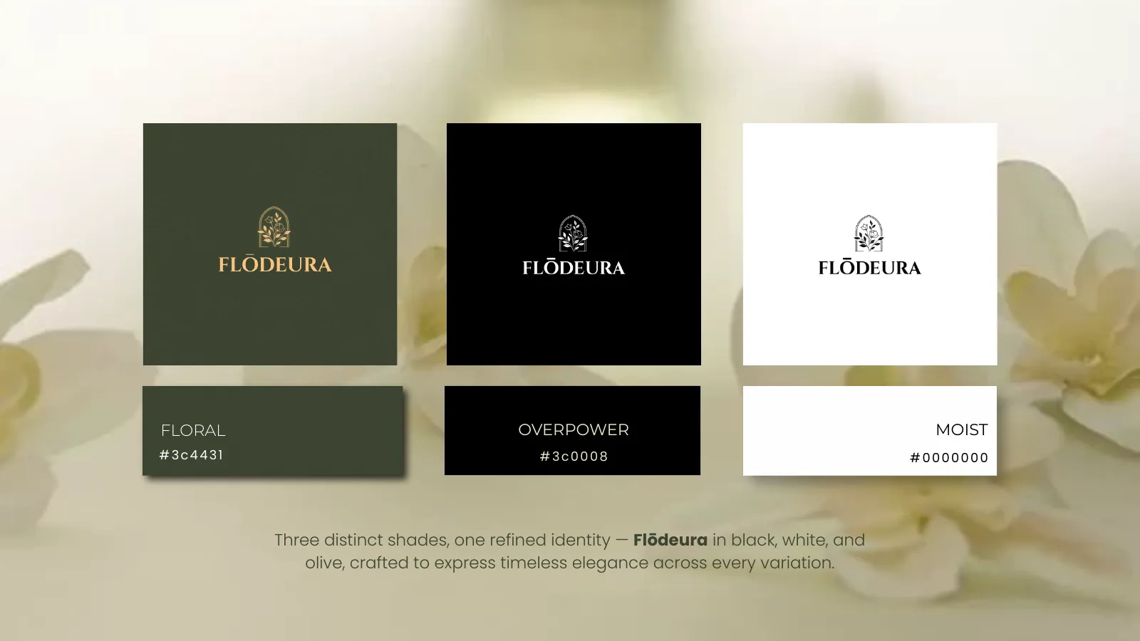
- 03
Typography
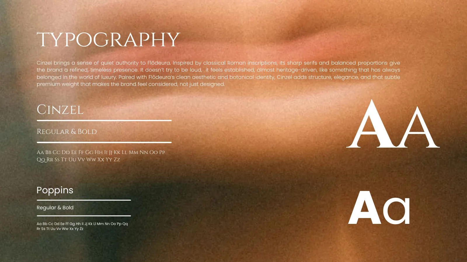
Cinzel brings classical, quiet authority. Poppins keeps everyday text clean and modern.
- 04
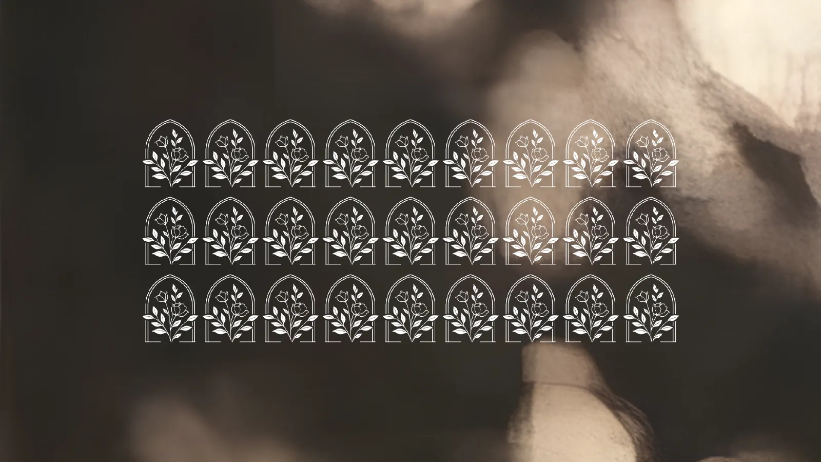
Emblem pattern
The arch emblem repeated for packaging, tissue and printed details.
- 05
Personality
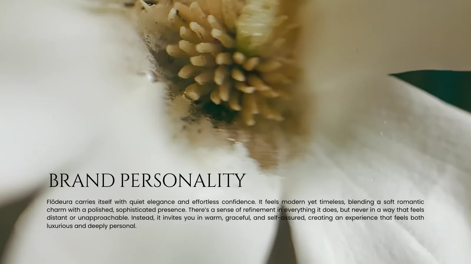
Modern yet timeless. Warm, graceful and self-assured, never distant.
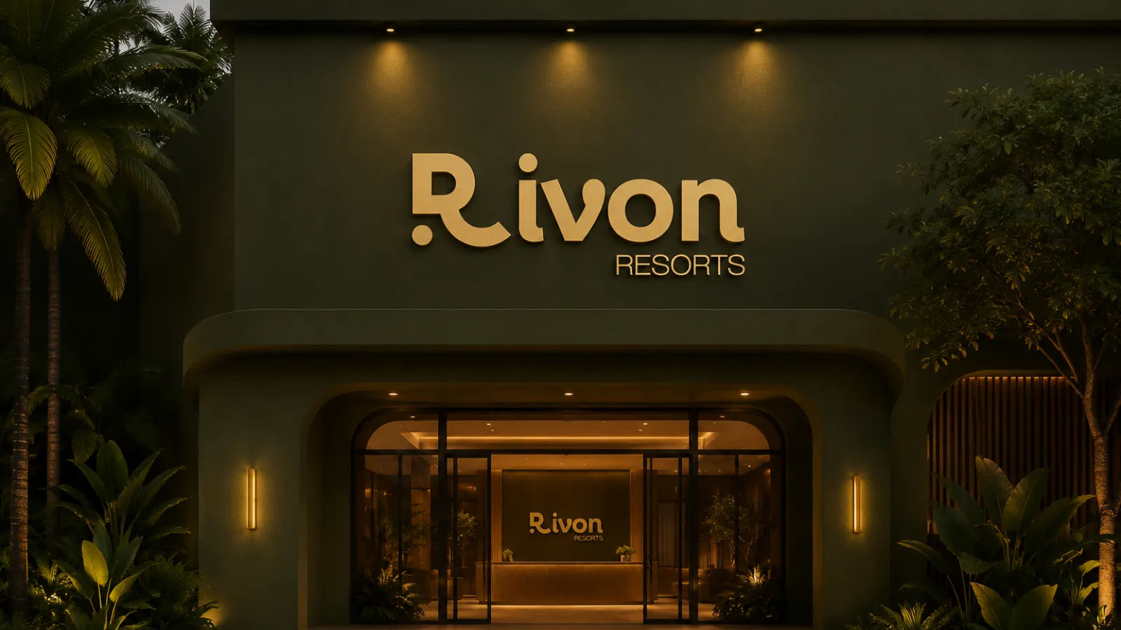
The brand in the real world.
Want a brand that feels this refined?
Tell us about your business. We'll show you how we'd bring it to life.